
The color wheel is a tool to begin your study of color. It can help you understand how colors relate to each other.
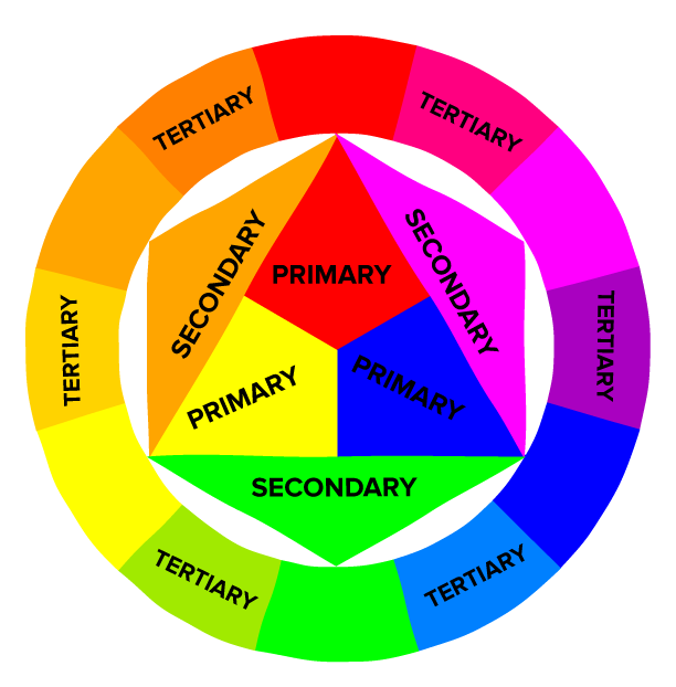
The color wheel is made up of the following:
Primary Colors - Colors which, in theory, are able to mix most other colors in the visible spectrum. In art, the three primary colors are considered to be red, blue and yellow. However, some artists consider magenta, cyan and yellow to be more accurate primary colors, as they are able to mix a wider gamut of colors. For the purpose of this post, I will use red, blue and yellow as the primary colors.
When you mix all three primary colors together, you get mud or a dark gray color.
Secondary Colors - What you get when you mix two primary colors together (green, orange and purple).
Tertiary Colors - What you get when you mix a primary color with a secondary color.
Cool colors are the ones that remind you of cool temperatures. Like Blues (water) and greens (forest) and purple (evening). Warm colors would bring to mind warmer temperatures. Yellow (sun) and red (chili peppers) and orange (desert flowers) Just an easy way to remember.
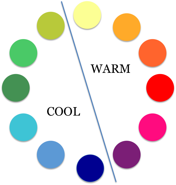
Warm colors advance and cool colors recede, affecting the perception of depth. This theory is based upon that fact that the eye adjusts when focusing on colors of different wavelengths. Red light waves have a longer wavelength than blue ones. An image containing both cool and warm colors would demonstrate contrast of temperature or warm/cool contrast creating more complex relationships between the color (warm colors can read cooler against a higher intensity warm colors and cool colors sometimes can advance against predominately warm
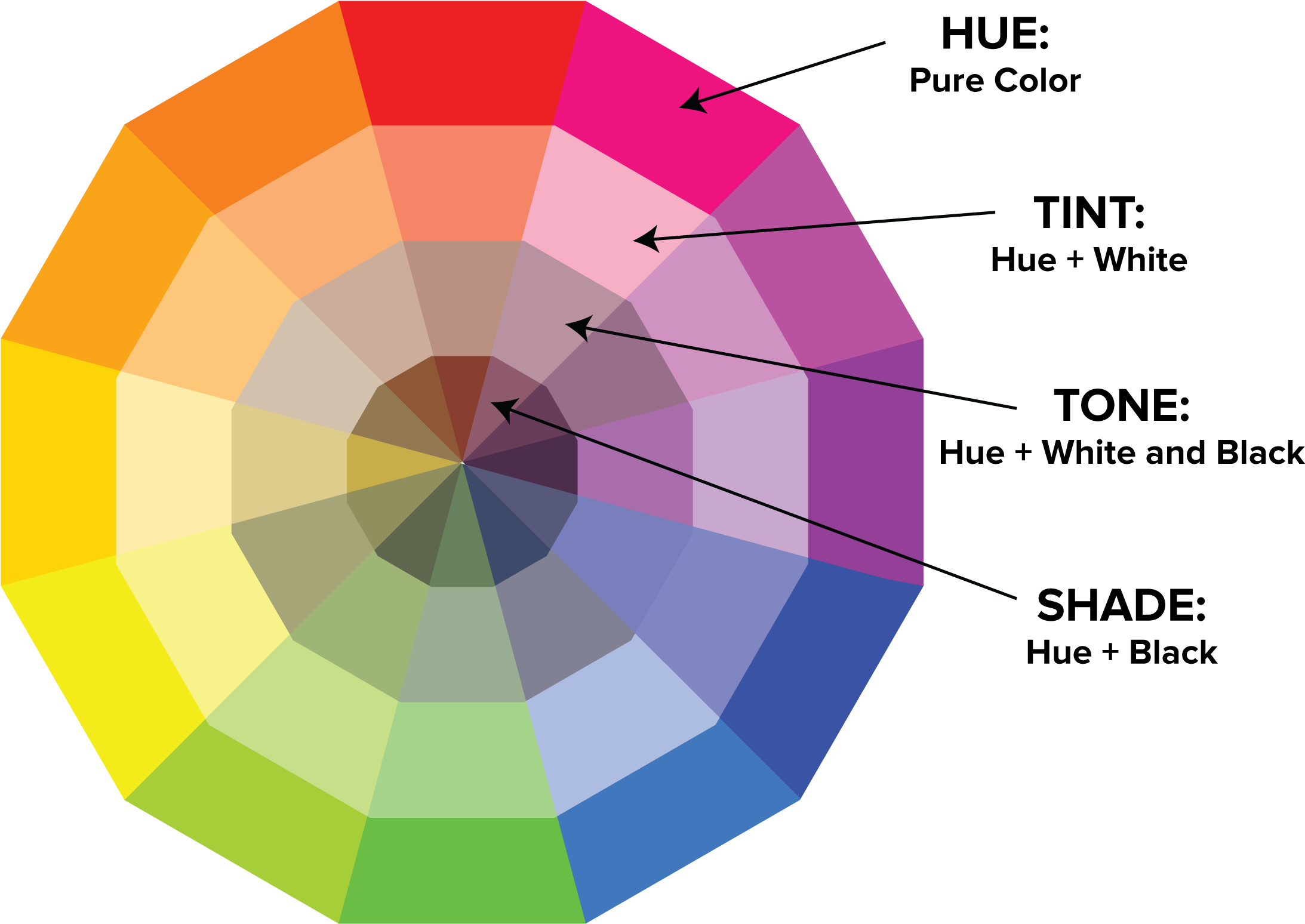
Many people use terms like “hue” and “color” or “tint” and “shade” interchangeably, but the terms have distinctly different meanings. Color is a very general term used to describe every hue, tint, tone, or shade we can see.
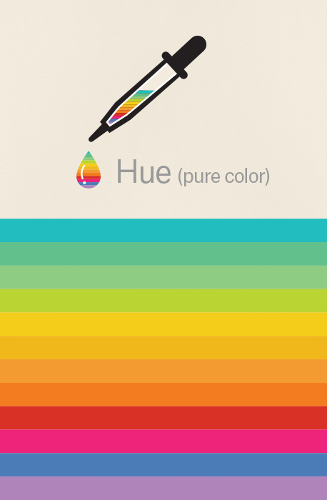
Hue: Hue refers to the dominant Color Family. White, Black and Grey are never referred to as a Hue. Hue refers to the origin of the colors we can see. Primary and Secondary colors (Yellow, Orange, Red, Violet, Blue, and Green) are considered hues; however, tertiary colors (mixed colors where neither color is dominant) would also be considered hues.
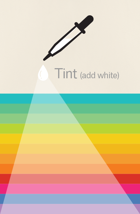
Tint: Tint refers to any hue or mixture of pure colors to which white is added. Pastel colors are generally tinted colors. Tinted color remains the same color, but it is paler than the original. When mixing a tint, always begin with white paint and gradually mix in small amounts of color until you’ve achieved the tint you want.
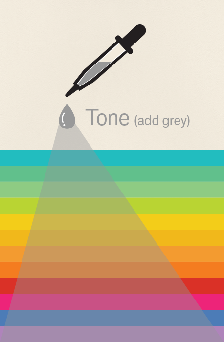
Tone: Tone is a hue or mixture of pure colors to which only pure gray is added (equal amounts of black and white). Adding gray to a color will make the intensity much duller. Beware of mixing too much gray into a hue as it can become over-dulled and virtually impossible to restore the brilliance.
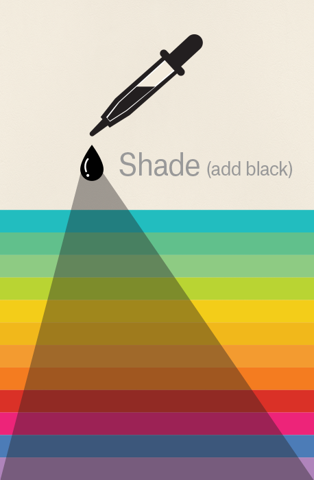
Shade: Shade is a hue or mixture of pure colors to which only black is added. It contains no white or gray. Shade darkens the color, but the hue remains the same. When mixing a shade, begin with the color itself then add black one drop at a time.
Color Scheme
A color scheme is used to describe the overall selection of colors in an artwork. The major color schemes in art are analogous, complementary, split-complementary, triadic, rectangular and monochromatic. These color schemes utilize colors at certain locations on the color wheel.
Before I get into it, I should point out that I don’t really think about color schemes all that much whilst I'm painting. Color is not so simple that you can just apply a color scheme and everything will work out.
#READ MY BLOG ON COLOR SCHEME IN DETAIL
Feel free to share with friends. If you want more painting tips, Read my articles
Register now to get updates on promotions and coupons.